
Lightpainting is visual art…
… and not the large amount of steel wool that is being torched in the picture! No matter how “cool” the floral elements, the orbs, domes, or whatever may be. No matter how impressive the location may be. If the result shows no recognisable image structure, no idea, no emotion, no creativity and no understanding of light, the whole thing is ultimately quite inconsequential. There are now quite a few light painters who obviously believe that this art form is exclusively about the “perfect” orb in as many colours of the rainbow as possible, or the cool floral element. No. As in painting or photography, it is about the good visual result.
It’s about creativity, the special experience of light painting, about light, about colours and above all about the story that the picture tells. An orb alone usually tells exactly nothing. Just as the lightly dressed, youthful model with the funny freckles or the kingfisher itself tell nothing either. This only works if the photographer, or the light painter, tells a story and has clearly thought about what he wants to show and tell the audience. In the case of the kingfisher, however, this becomes difficult. What story should a kingfisher tell the viewer? The only thing that remains is that it is “rare” and not every fool can take a picture of the kingfisher with his smartphone. I will never understand how an artist can be so unpretentious as to be celebrated for the model’s large, shapely breasts and not for his own special, creative achievement in depicting them.
In my opinion, however, what light painting should be less about is perfection. Just because the light figure is not “perfect” does not mean that the painting is not good. Most viewers would not reject a light painting because the orb is a little out of joint. And one’s own artistic standards should always be oriented first to the result and not to the perfect form of light painting. Of course, this in no way means that one should simply paint anything into the picture without any motivation.
Of course, I am not the master of absolute truth, and there is no such thing in art. I can only express my own personal opinion here. I certainly have very different experiences in the field of art and photography than most of my light painting colleagues. I have a different taste. I have different viewing habits. Nevertheless, certain rules of design have existed for many centuries. And there is a good reason for that. Some ideas almost always work for every viewer, some ideas almost never do.
Success?
Just because someone is a “successful” businessman, constantly rattling loudly, telling everyone he’s the greatest, buying followers on Instagram, making “funny” YouTube films or winning some important competition doesn’t mean he’s a great artist and delivers great visual art. Van Gogh was a poor bastard because he was not a good businessman. Nevertheless, he was a great artist who had a vision, who was obsessed with his art. And that’s how art works. It is not an art to copy supposedly successful pictures of others. It’s not an art to siphon off the ideas of others and pass them off as your own. There is no art in taking the same picture every day because it is so terribly “successful” on Instagram. I don’t want to judge that at all. Whoever is happy with such “artistic” work should do it that way for all I care. For me, however, it would be nothing. Above all, one should not try to emulate such “artists”. I’m pretty sure that in the long run, that hardly brings any satisfaction. It certainly works much better with one’s own idea than with the copy of the copy of the copy, even if one doesn’t become “famous” with it.
I’m not talking about inspiration here. Without inspiration from a variety of sources, in many cases I would not have come up with the idea of realising the picture exactly as I did. And I’m not talking about taking a trick or two from colleagues and using it in your own pictures. I’m talking about the fact that there is a creative part of one’s own in the pictures. Art reflects the soul of the artist. Art makes the artist happy. Art means life for the artist, completely emancipated from “success”. An artist does not bend himself for his audience. The artist does not define himself by the strength of the applause. He does what is meaningful to him at that moment. It is as “simple” as that.
Less is more!

The real art consists in limiting the picture to the most necessary. Any ornamentation that does not contribute to the picture’s message only disturbs and distracts the viewer’s gaze. The eye should always be drawn to the (main) motif. If there is no motif, or too many of them, the picture can hardly work.
I could have put two orbs, four domes and half a quintal of steel wool in the picture and illuminated each stone in a different colour to show everyone what great light painting skills I have. But the result would certainly not have been better, quite the opposite.
Colors

I have already written a few articles on this topic. You can find them here:
- Colours in Light Painting Part 1
- Colours in Light Painting Part 2
- Colours in Light Painting Part 3
- Colours in Light Painting Part 4
Basically, the following applies to the choice of colours: “Less is more”. Even if this is not a fixed law, of course. Of course, you can also use a lot of coloured lights in light painting if it is conducive to the image.
Symmetry
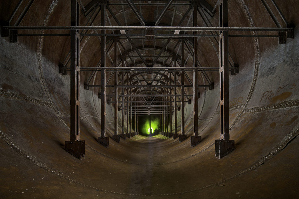
Of course, not every picture has to be symmetrical. In many cases it is not possible at all. In my opinion, however, the example image only works if the image is perfectly symmetrical. If the camera were slightly offset or not exactly aligned with the centre, the picture would not “work”. Hardly anyone would like to look at such a picture. The same applies to the picture of the railway bridge above.
So if you want to have a symmetrical image composition, you should also make sure that it is taken perfectly symmetrically, i.e. that the camera position and optical axis are correct.
Try to position the tripod accurately. In many locations you can orientate yourself quite easily on the ground. On the bridge, for example, I positioned the tripod exactly between the two rails. In other cases, a folding rule or an electronic rangefinder helps.
In the next step, I align the camera with the help of the virtual horizon of the camera in order to avoid converging lines in the picture. Using the camera’s Live View, I check whether the centre of the room is actually in the centre of the picture. A good way is to attach a cross line laser to the flash shoe and then bring the laser cross to the centre of the room by moving the tripod. To get the picture higher, you should not tilt the camera but increase the total working height, i.e. extend the tripod further. The small travel tripod is not very good for long exposures anyway. Most of the time they are not very stable. At the moment I usually take the Benro TM48CXL with me. The working height without a centre column is 1.96m. With the centre column and gearhead mounted, you need a ladder to reach the camera. So the centre column is usually at home. The tripod is not a bargain. But it is very stable, light and robust. I won’t need a new one any time soon. In contrast, I have already destroyed several small travel tripods from different manufacturers, and they were not no-name cheap parts either.
Crop and format


What’s the saying? A picture is worth a thousand words. Here I have cut the same picture afterwards in three different versions. I cannot imagine that there are viewers who like all three versions of the picture equally well. Even less can I imagine that there are viewers who like the first or second version best.
I usually choose the crop before I take the picture, even though I usually leave some “space” to be able to crop the picture differently on the computer. Usually, only a maximum of 10% of the image area is cut away.


16:9 – 4:3 – 1:1 – 3:2. Those who, like me, have been taking photographs for a long time usually see a picture in 3:2 or 1:1. In the days of analogue photography, it is highly unlikely that anyone would have thought of cutting a photo in 16:9 or 4:3 format. I’m not talking about panoramas or anything like that, but about cutting a single normal photo.
Since televisions and computer monitors have been available in 16:9 format, this format no longer bothers most viewers of photos, especially when the photo is viewed on such a monitor. In the case of the bridge, this format suits the wide motif well, in my opinion.
So far, I have not been able to make friends with the 4:3 format at all, even though one sees such pictures quite often since the introduction of the Mirco 4/3 cameras. In the case of this picture, this format suits the subject the least.
The square format presents the motif in a completely different way, but in my opinion it also works well here. However, I would rather make a print of this picture in 3:2 format.
Even before you take the light painting, you should think about the result and work with the right format and cut, instead of trying out what looks best on the computer later. At the latest when the result is to be a large format print, the quality may suffer if I cut away 50% or more of the image area and thus also halve the resolution.
No light without shadow

Without the shadows, without the many tonal values, this picture would be quite inconsequential because the depth would be missing. The image would be two-dimensional, flat and boring. This picture works because the brightest area is directly behind the subject and the brightness clearly decreases towards the outside. The viewer’s gaze is always drawn to this spot in the picture. If the entire tunnel were uniformly illuminated with the same brightness, this effect would not exist.
The additional shadows cast by the grille in front of the lamp reinforce the effect, but are not absolutely necessary here.
So that the front area of the picture, especially on the ground, does not “sink”, i.e. is shown black without a visible structure, I illuminated the scene from the front with the green torch in the second step. Of course, you have to be careful not to light up the shadows completely.
Depending on the mood you want to create and the image you want to convey, you can also take a picture like this without or with less lightening of the shadows. In most cases, having large dark areas in the picture is not very conducive to the result. The idea of a large “negative space” is quickly overused and worn out, in my opinion.

But as the example picture shows, for some picture ideas it is necessary to keep larger areas in black to increase the effect. Light in the background would immediately make the picture “ineffective”.
With such pictures, you should always make sure that the direction of the light is right. The moon between my hands does not shine light from above into my face. This would confuse the viewer, even if it might make me look less scary. Technically, of course, it would be no problem at all to use another lamp to lighten the shadows in my face or to position a reflector appropriately. But then the result would be a completely different mood.
It is important to find an illumination for the light painting that suits your own idea and not to always work according to the same pattern if the mood in the picture is to be completely different from the last picture.
However, the Light Painter’s control of the light in front of the camera is not the only aspect of how the light actually appears in the result. The camera used has a certain influence. The greater the dynamic range of the sensor, the more tonal values will be visible in the result. With a lower dynamic range, areas will no longer have any drawing that my Nikon D750 still makes visible. In general, light painting images, or rather all images that do not require the high output of 200 images per hour, should be taken in RAW format. The sensor processes more information than would be stored in a compressed JPG. Another aspect is the better possibility to de-noise the image when working with RAW.
The results are usually even worse when working in Live Composite mode, which some cameras offer. Since this technique limits the light, nothing burns out if the settings are right, but there is a danger that many parts of the image are displayed with exactly the same brightness. This often looks as if the light figure has been stamped into the image and the whole image usually looks flat and boring because it has a low tonal range and hardly any gradients in the shadows and highlights.
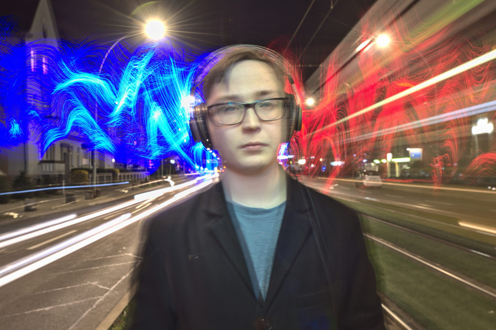
I don’t want to demonise live composite. I could have used it in the example picture because the brutally bright city lights only allowed an exposure time of 3 to 4 seconds at f/16 and ISO 50. I almost started sweating because I had to move so fast with the light brush and quickly cover the lens again and again. You can also use this for other purposes, such as in the photo box.
However, it would never occur to me to use this technique all the time just so that I can see on the display whether the picture is ready.
Apart from the reasons mentioned above, I could hardly concentrate on my work in front of the camera if I kept looking at the display. Besides, for me it’s a bit like “painting by numbers” when I check whether I’ve already illuminated everything “correctly” and then have to constantly rework until the result is right. The learning curve is also not very steep with this way of working. If you want to develop an understanding and feeling for working with light, if you want to be able to think in terms of light at some point, you should rather do without Live Composite and instead concentrate fully on what you are doing in front of the camera. Many Olympus light painters probably don’t know this, but I’m pretty sure that these cameras can also be used normally in bulb mode 😉
With this in mind, I wish you good light, lots of creative ideas and, above all, that you never lose the fun of light painting.
Sven


Dankeschön für den sehr informativen Text und die klasse Beispielbilder. Ich kam zum Lightpainting über eine Fotowalkgruppe, was dann ein passives Lightpainting ist, weil man ja nur fotografiert. Vor ca 2 Jahren hab ich es aktiv angefangen und kann/konnte die technisch perfekten Bilder der anderen Lightpainter nie erreichen, sehe es aber auch so, dass eine Bild- Idee ganz wichtig ist. Die Frage ist nur, ob eine brilliante Technik nicht doch leichter erreichbar ist, als brilliante kreative Bild-Ideen.
Hallo Peter,
vielen Dank für Deinen Kommentar. Der Artikel gibt natürlich nur meine ganze persönliche Meinung wieder und beschreibt meinen Anspruch an die Kunstform Light Painting. Wenn Dich die perfekt erstellte Lichtfigur glücklich macht und Du Spaß beim Light Painting hast, machst Du Alles richtig und verschwendest nicht Deine Zeit. Die “Einsicht”, dass Light Painting auch gute Ergebnisse, unabhängig vom technischen Aufwand, auf den Sensor bringen sollte kam bei mir auch erst nach einigen Jahren. Ich wünsche Dir weiterhin viel Spaß beim Light Painting und freue mich, wenn Du wieder mal hier vorbei schaust. Im Moment ist die neue Seite noch eine Baustelle. Ich werde nach und nach die alten Beiträge wiederherstellen und sicher kommen dann auch Neue dazu. Ich hoffe, dass ich ab Herbst diesen Jahres endlich wieder Workshops anbieten kann. Vielleicht lernen wir uns dann persönlich kennen.
Viele Grüße
Sven
Hallo Sven, schön zu hören, dass Du die alten Beiträge wieder reinstellst, ich hab schon einen vermisst, den Beitrag über die Nebelerzeugung per e-Zigarette. Oder täusche ich mich da?
Hallo Peter,
ein Backup des Artikels über Rauch und Nebel findest Du hier: https://lightart-foto.jimdo.com/2020/08/03/light-painting-mit-rauch-und-nebel/. Allerdings nur so lange bis der Artikel auf dieser Seite veröffentlicht wurde.